LED Lighting Designers should learn as much as they can about the
psychology of light colors. Choosing the right colors when lighting a home or business is more than just choosing pretty hues. Color can affect the way a person feels and, when used correctly, can enhance the quality of the lives of the people who spend time in the environment being lit. Proper lighting and wisely chosen colors can possibly even increase life expectancy.
Unless a person is color blind, humans are deeply affected by colors in one way or another. Have you ever seen one of those videos where a color-blind man gets a set of those new glasses that allow color blind people to see colors for the first time? It’s very moving to see how emotional an experience that is.
Color appeals greatly to our senses. Certain colors create their own unique effects and will stimulate areas of the brain in ways which will promote either excitement or tranquility. This is important to consider when lighting areas of a person’s home. In the same instance, if you light someone’s livelihood investment, a high-energy business atmosphere is a must.
Every light has a different color hue and light will vary on different surfaces. Not every building you light will be a blank white canvas; in fact, most won’t. The use of
color in outdoor lighting designs is something to be studied.
Whether it’s music, poetry, cooking, or color, harmony means a sense of order, a balance in the visual experience. Remember that the opposite of harmony is chaos. When you are creating a
color branded lighting design, you need to balance the colors so there is harmony. Too many colors, especially ones that don’t work well together, can create a visual experience that’s overdone and overstimulate the brain. The human brain rejects what it cannot organize or understand and will also reject under-stimulating information. In other words, if the colors are dull, the human brain rejects them as boring. Color harmony delivers visual interest and a sense of order.
The Effects of Vibrancy and Color Blending
Vibrancy is what dictates the
emotion of a design. Brighter colors create a more energetic result, which is particularly effective when you are trying to get an emotional response.
Darker shades: These are relaxing and allow people’s minds to focus on other things.
Brighter colors: Brighter colors can lead people to feel more energetic and, as a result, can better evoke response or reaction from them.
Color choices, brightness and color blending can elicit strong emotions. You are the one making those decisions with the client. It’s psychology and you must study it and get to know the people the property you are being entrusted to light. In a way, you have a piece of their lives in your hands.
How do certain colors influence people?
Green
Green is most associated with health, tranquility, and nature. When lighting trees and foliage, even though they are already green, you may consider using green lighting to enhance their natural beauty.
Green is also closely associated with money. This is something to consider when you have an opportunity for lighting a business. The owner(s) may want to elicit the response from customers that the business will bring them wealth. Show them the green and show them the money.
It can also be used to relax customers, so green can be a great choice for residential lighting and around businesses that want people to feel comfortable and at home.
Green stimulates harmony in the brain and encourages a balance between body and emotion, leading to decisiveness as well.
Blue
Young people associate blue with maturity. Lots of hospitals and medical offices utilize blue. It is the color of water and the sky; therefore, the effect of calming the mind will induce senses of tranquility, space, and security. When lighting someone’s home, blue is a good choice for areas where the family will want to enjoy some peaceful moments.
On the downside, blue can be associated with sadness. We all know the expression, “having the blues.” Be cautious not to use blue in a way that feels depressing. Master the design; your customers are counting on you.
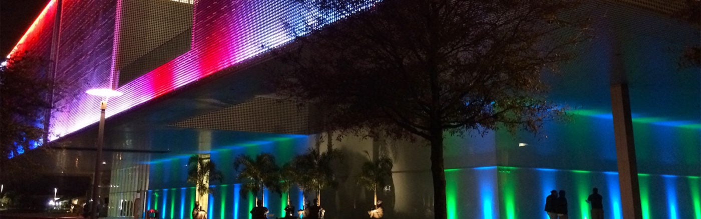
Color branding affects people’s perception in profound ways. In Scotland in the year 2000, the city of
Glasgow installed blue street lighting in some of their neighborhoods. Shortly thereafter, they reported a reduced crime in those areas. Not that you want to promise clients that blue will keep crime down in their neighborhood, but that’s something to note for sure. Safety is a pain point that customers appreciate being considered. Correct
lighting applications can alleviate this concern.
Red
Red can encourage appetite, so it is often used by fast-food chains and general businesses that sell food products. Also, Red is associated with movement, passion, and excitement. This vibrant color attracts focus towards it; and as a result, it exudes high energy. Using red lighting, when appropriate, could draw the eye toward the object being lit.
Red is a great color to use when seeking to grab attention, get a reaction, perhaps evoke passion or even romance. It physically stimulates the human body, affecting nerve impulses, raising blood pressure and heart rate.
If your client wants to stir up action and excitement, red is a good choice for lighting.
The more you learn about the effects of color, the better your LED
landscape lighting designs will be for the clients you work with.
At Garden Light LED, we have lighting design experts on staff who can help guide you in
choosing the right colors for your designs as well as the right
lighting fixtures. Our products are all American made, right in our facility in Tampa, Florida and are built to last longer than anything on the market today.